
Watch out for too much pop: contrast is great at first
Beware the extremes
A current trend seen in images posted online is adding a whole lot of pop and zing. Be it heavy contrast, heavy HDR processing, or extreme saturation, they all jump out of the screen and grab you. Which is exactly why they’re popular: it is getting harder and harder to grab someones attention these days in the flood of media at us every day. So people see them, click “like”, +1, heart emoticon or whatever and then keep scrolling. If you want a lot of likes, you don’t actually need to worry too much about quality because they’re just scrolling by and won’t stop to study your image in detail. However, if you want them to come back to it, study it and truly appreciate it then this article is for you.
The Good: images with heavy processing do grab you quickly, no doubt about it. And those processing techniques work well when the viewer is just passing by. To get them to pause and click at all, images with a huge amount of attention-grabbing color and contrast will get their attention.
The Bad: But is that the type of viewer you’re trying to attract? The ones that just glance quickly and move on? Or would you rather have them stop and stare? And think and ponder? And appreciate+ And then appreciate it even more every time they see it again.
The Ugly: The reason why heavy-zingers don’t work in the long run is that they introduce artifacts that become glaring the longer you study an image. And the more you study such images, the more glaring problems you will find. And your viewers will find them too. There is nothing sadder to a photographer than a print on the wall with errors. You can’t unsee them once you’ve spotted them.
Subtle Greatness vs.Immediate Gratification
Our mind is often tricked by subtle transitions, which is why gradient filters in the field and gradient masks in post-processing work so well: if it is a subtle adjustment applied over a huge area of the image, we likely won’t notice it was done. But heavy processing is exactly the opposite of this. The transition from one region and the next is stark and the unrealistic flaws are easy to spot.
But we still won’t often spot any problems in the first glance at an image because we’re too busy looking at the image as a whole. But the longer we stare at an image or the more times we walk past it, the more likely that we’ll begin noticing the small individual pieces and detail, and it’s here where the problems will lie.
Our perspective and opinion about a piece will start with “wow, that’s stunning” but afterward it will slowly slide off the cliff landing on “Oh, actually… it’s not that good after all”.
A Case Study
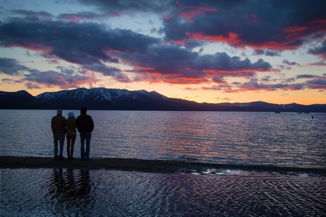
Let me show you an example. The following three images were processed using three different tools. The first was processed using the Photomatix HDR (High Dynamic Range) software, the second was produced using the newer [eafl id=134 name=”Aurora” text=”Aurora HDR Software”], and the last was processed by entirely by hand in [eafl id=293 name=”adobe” text=”photoshop”].
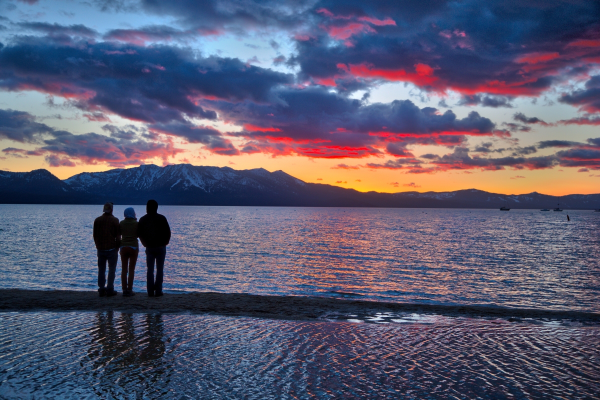
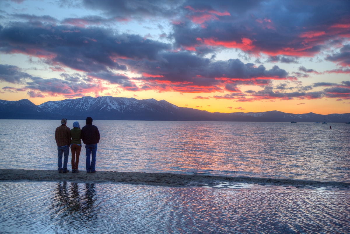

The first two images likely jump off the screen at you. The Photomatix and Aurora HDR software are simple to use and quickly produce high-contrast, extremely vibrant images with their default settings. Even at the zoomed-out level, you can probably begin to see some issues with Photomatix output, however. The [eafl id=134 name=”Aurora” text=”Aurora HDR”] software is significantly newer and does a much better job providing smoother processing with it’s default settings. But if you use either software without manually adjusting the settings you’ll get images with problems in the output, as you’ll see below. The final image, which took a lot more time to produce, doesn’t have the same level of “zing”. But hopefully you’ll find far less artifacts in the results.
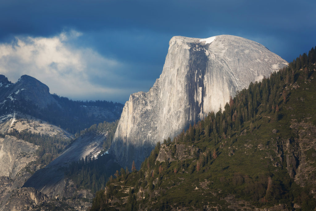
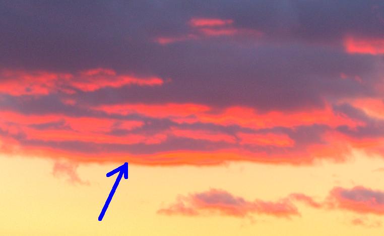
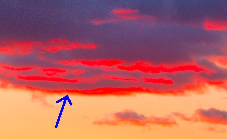
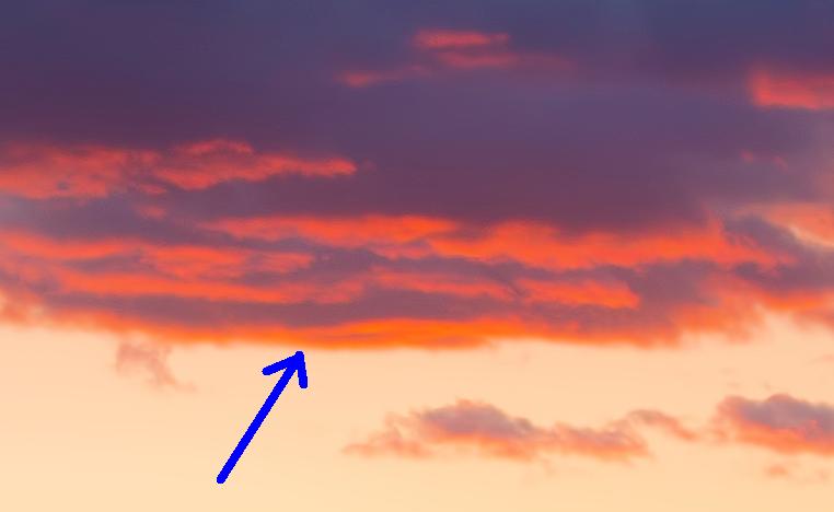
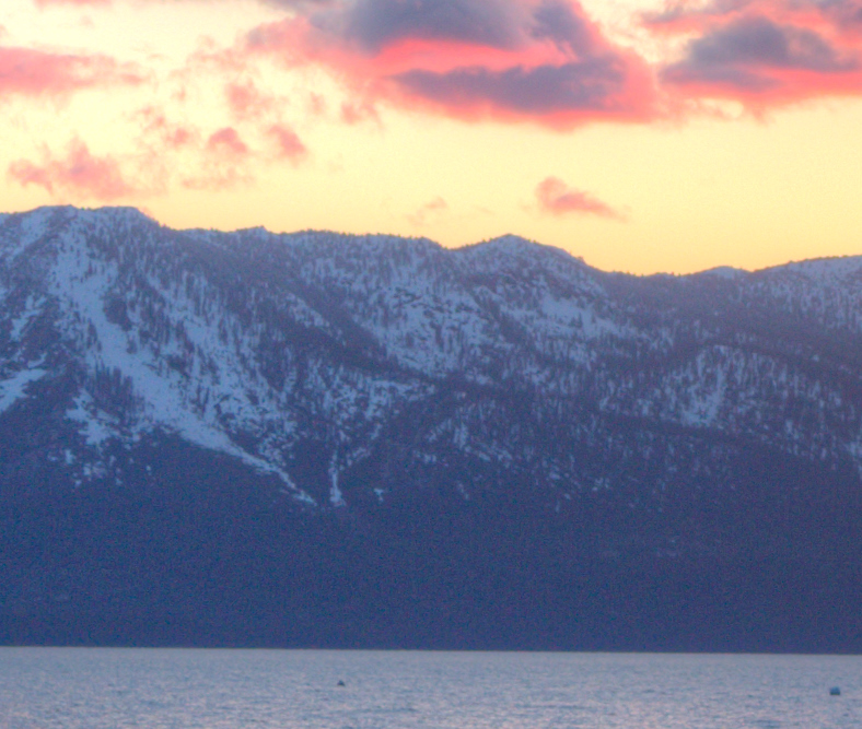
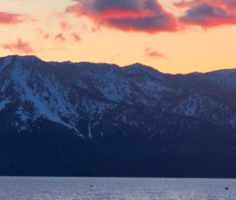
Let’s look at those clouds
If we zoom in to the clouds at the top of the images, we’ll find that there are a number of strange artifacts and blown highlights in the automatically processed images. Even in my manually processed image there is less detail than I would normally like in my images, but alas I didn’t take a shot at -4 exposure like I should have. Study the following three zoomed-in images and decide for yourself which ones you would want to further adjust and fix (regardless of software)? Which of the three is the most natural and most appealing when you stare at it for a long time? Look at the highlights near where the arrows are pointing and decide if they are natural cloud structures and colors that would occur in nature or not. Do you like that the colors switched rapidly to orange in the first two? Does that make the image better or worse? Which would you prefer to look at for a long time if it was hanging on your wall?
Note: photography is a form of art! There is no right or wrong answer to these quetsions. I’m asking you to think and pick for yourself. Only you can decide how you want to process images your images, and what type of images you want on your walls, desktop backgrounds and screensavers!
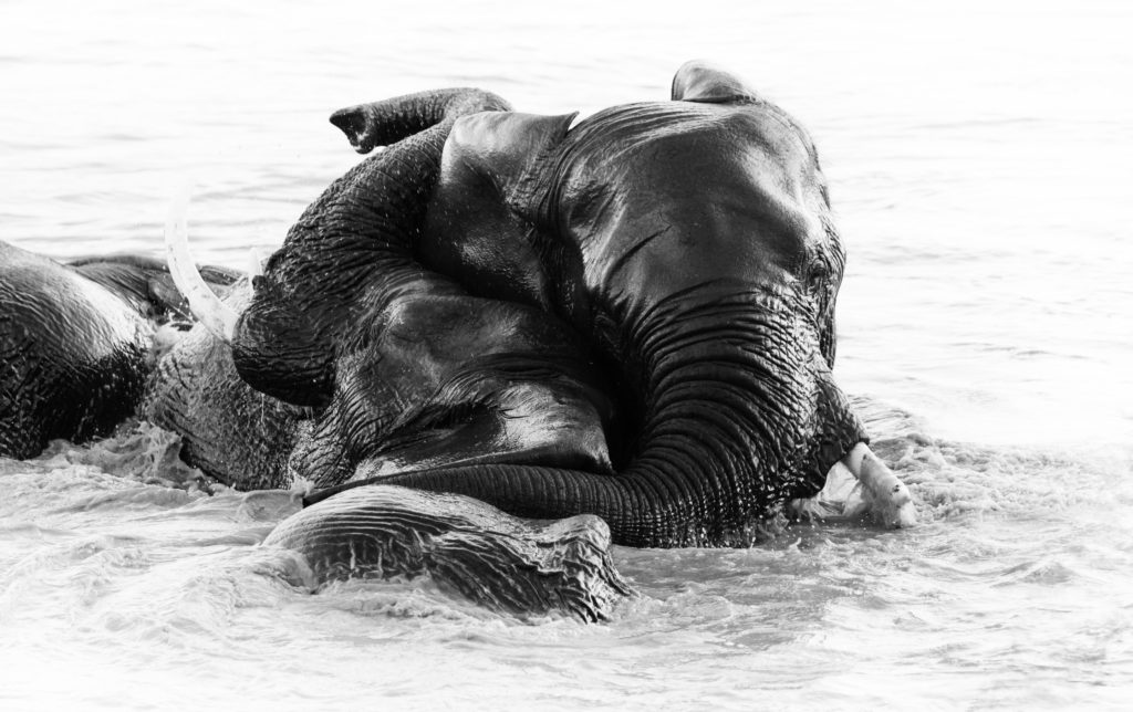
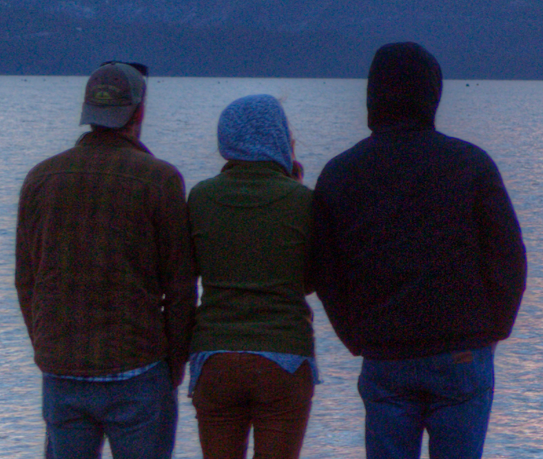
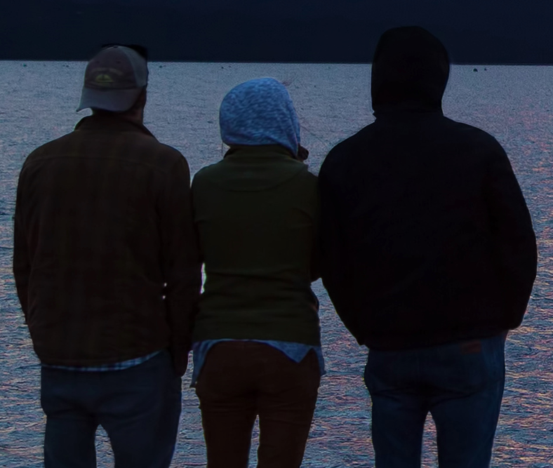
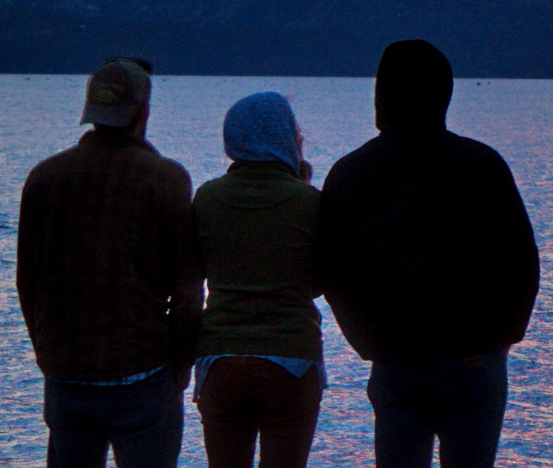
Let’s look at those people and those waves
People and moving objects are the most difficult thing for HDR software (and humans) to process. On the upside, HDR software knows this can be a challenge and offers the ability for you to mark areas where movement may have occurred and the software will attempt to deal with it. It often does a pretty good job for people that are moving, and it often does a pretty good job fixing overlapping motion in the output. Except, in cases like this shot or any picture that contains moving water (especially the ocean), where half the whole scene is moving; There is simply no way that the software can accommodate for that much movement in the scene. I’m impressed with Aurora HDR’s attempt at the water though, but Photomatix didn’t fair as well IMHO.
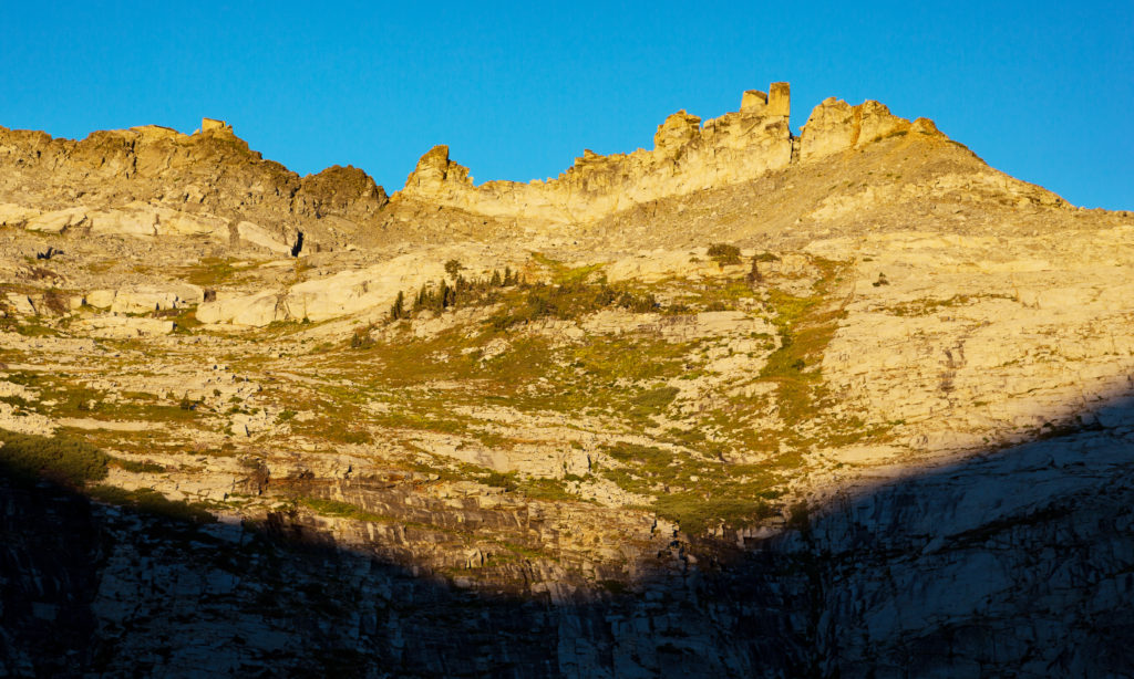
Let’s look at those mountains
High contrast and pop always comes with a trade off. In order to get extreme levels of contrast, you’ll invariably end up adding a lot of noise, frequently with banding and sometimes you’ll lose detail and sharpness as well. The following three images show three more zoomed-in sections of the Photomatix, Aurora HDR, and my manually blended set of images. Which do you think would look best in print? Which would retain long-term attention and respect, especially when printed large?

Fixing problems with all of the techniques
All HDR processing methods have challenges and, fortunately, solutions. But all of the solutions take time. We humans are always looking for ways to save time, and if we have a software tool that speeds up processing, well, we’re bound to like it! However, most automated systems cause problems in their output because the software doesn’t have human eyes that can catch problems and unrealistic components in a scene.
To be perfectly honest, this was not a fair test though! Specifically, I took a default Photomatix and Aurora HDR output preset that I thought looked the best and saved the result without making any modifications to either software’s slider sets. If I wanted to make a good looking, algorithm-based HDR image using either of these software programs, I’d go fix the issues I found before printing it. In the end, though, I question if I’d save much time by trying to achieve the same level of quality with any automated software. Specifically, I’d likely still end up blending, cloning, painting, adjusting and fixing the output.
But! Maybe the algorithm generated images from Photomatix or [eafl id=134 name=”Aurora” text=”Aurora HDR”] may be better starting points for you! Just be aware that you still need to carefully examine and adjust the output to make sure it meets your long-term quality expectations. The problem with the HDR Hole isn’t that automated HDR software is being used, but rather that artists stop looking at the results with a critical eye and accept the output regardless of the quality level. I’m encouraged by the fact that [eafl id=134 name=”Aurora” text=”Aurora”] has added the ability to selectively edit areas separately using masking, and thus would let you work toward perfection within the HDR software itself.
Conclusions
These days, when people use the phrase “High Dynamic Range (HDR)” they’re almost always referring to software that auto-processes multiple exposures into a single output image. But the reality is that all of the above images, including the ones I created by hand, are technically “HDR” because they meet the real definition:
“[HDR] is often achieved by capturing and then combining several different narrower range exposures of the same subject matter.”
This is exactly what I did manually, but I used advanced masking techniques in [eafl id=293 name=”adobe” text=”Photoshop”] rather than letting the algorithms in HDR software perform their magic without my help.
HDR software is getting better and better, but the results must be checked. Simply pushing the render button without carefully studying the results can lead to regret later. In order to get high-quality images out of automated HDR software, you’ll need to carefully control the algorithm parameters to ensure good results. Find and use the tools and techniques that work for you and produce the output you’re proud of. But do walk away from your work for awhile to see if you catch any errors before publishing or printing it.
6 things to watch out for in high-pop images
Here is a list of the top six things I think you should watch out for when creating HDR images of any kind:
- Chromatic aberrations (“glowing” lines near bright/dark borders — often greeen or magenta)
- Noise *(You’ll really notice it after printing it)
- Flat mono-chromatic areas (which happens when the contrast is pushed too far at the extremes)
- Rapid color shifts away from reality (this happens because saturation is pushed too far and the hue is affected)
- Impossible lighting (e.g. look for tree tops that suddenly get darker as they stick above a horizon line)
- Fuzzy areas near movement (anything moving in scene or in the wind will have overlapping “ghost” copies)
Go back to the zoomed-in shots in the examples above you’ll find all of them somewhere.